
CATEGORY
Website Design
CLIENT
Skillify
Year
2022
Refreshing the student
learning experience
Skillify is building a better online learning experience for students interested in learning how to code. In this new website design, we set out to solve the problems below within a 4 month timeframe.

My role
As the only product designer on the Skillify team, I was in charge of the redesign of the online learning platform, the creation of the design system, branding, and digital marketing. Over the course of 4 months, I worked alongside the founder, a software developer intern, and a senior software developer.
The key problems
Product features
Missing product features can result in missed business opportunities. If certain features are not working correctly or well, our product may fail to capitalize on user needs an be competitive within the market.
Brand & product perception
The copywriting and visual elements do not speak to the brand – they lack consistent emotional branding and a clear strategy. Our messaging gives users the impression of low quality education and product offering.
Inconsistent experience
Having design inconsistencies disrupts the user experience, making it easier for users to drop off the platform. In addition, without a consistent and mature UI and design system, we will consistently invest time in enhancing and expanding existing solutions.
Our users
Before we started designing, we did a deep dive into existing users to understand them better. We conducted several customer interviews focusing on identifying why our users use our product/service.
We defined 2 personas, and mapped them to their respective user journey.

The career change
An individual looking to transition from one field or industry to another in pursuit of a career path different from their previous experience.
Jobs to be done
When I apply for new jobs, I want to be able to show my skills and knowledge in coding, so I can land a technical position.

The new graduate
An individual recently graduated from university or college in pursuit of an alternative career path and learning a new subject.
Jobs to be done
When I look at my possible career path, I want to pursue a career in tech without spending thousands of dollars, so I can learn the skills needed to work in the tech industry.
A customer journey map was created to understand the users journey from their research stage up to their pose use of the product. This helped identify key emotions, thoughts, and tasks.

Our goal
Establish a strong brand and improve product perception while providing a consistent and efficient platform to help and support the user’s learning goals.
Early ideation
We started off with a design sprint with the Product Manager and Software Developer.
Using Figma as a remote collaboration tool, we gather inspiration on on how other coding academy’s offer their learning experiences, and shared what we liked about each of them.

We mapped out a user flow to visualize the path our user would take through our product from logging in to completing a quiz, assignment or course.

Then, we proceeded to create low-fidelity wireframes base on the information we gathered from the user interviews, competitor analysis, and user flow. Our focus at this stage was to create out as many ideas as possible.

Final designs
Multiple progression visuals
The dashboard features a progress bar that visually tracks achievements after completing lessons, quizzes, and assignments. The second design bar, accompanied by a percentage indicator, is integrated into lesson and quiz pages, providing a clear overview of progress and remaining content. This design fosters user motivation and engagement in the learning journey.

Multiple submission options
Offering two assignment submission options:
1. Drop box
2. Insert link
Integrating an assignment submission section within the platform streamlines the process, eliminating the need for users to email their assignments to instructors.

Uniform design structure & brand
Every module adopts a consistent design framework, ensuring users can effortlessly comprehend the information presented. Enhanced Readability through Modular Content Organization:
Information is systematically divided into smaller sections, promoting a more accessible and engaging reading experience.

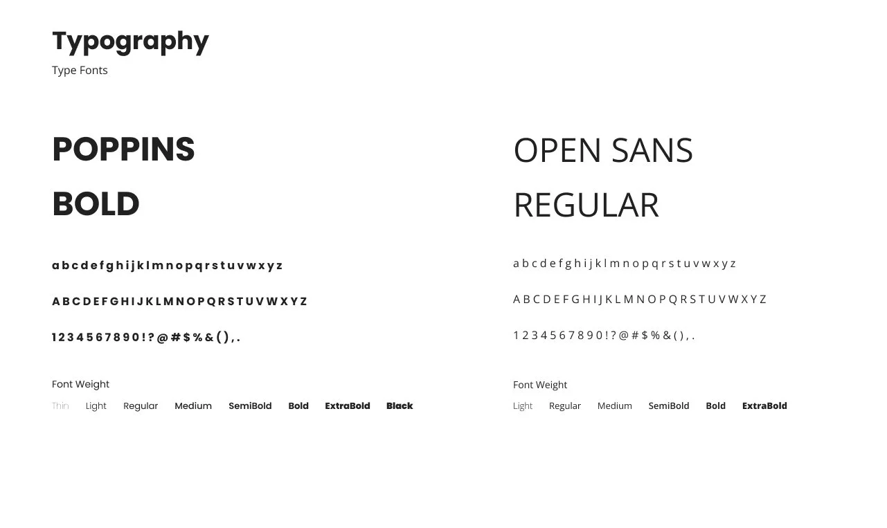
Design System
I built the brand and system for the platform.
At the time, Skillify was undergoing a major rebrand and changing their product offering. They were transitioning from a children’s math gaming company to a mature learning environment. Hence why there needed to be a brand refresh.


Key takeaways
Reflecting on project outcomes
After working on this project from start to finish for four months, we successfully completed it in April 2022. Currently, the team is dedicated to developing and launching our new platform. Leading this project has been an immensely fruitful journey for me. My internship experience at Skillify differed significantly from my previous placements, as I had the opportunity to wear many different hats. This meant I was responsible for various aspects of the startup, including but not limited to design tasks, marketing initiatives, and establishing pricing models for courses. As the only designer on the team, I cultivated my skills in leadership, design, and problem-solving.
Challenges we ran into
❁
Ensuring growth.
How to create a product and design that is sustainable, and ensures growth.
✎
Our team is very small which meant that we had resource constraints. We had a lot of work for small but mighty team or 4.
Resource constraint.
How I grew as a designer
♛
Improved my leadership skills by leading the design process of the learning platform from start to finish.
Leadership.
☎︎
It is important to communicate clearly and frequently with teammates to ensure that everyone is on the same page.
Clear communication.